
What Does a Neural Network Want to See?
Some thoughts on Chris Olah and collaborators' introduction to feature visualization, and what its limitations teach us about interpretability.
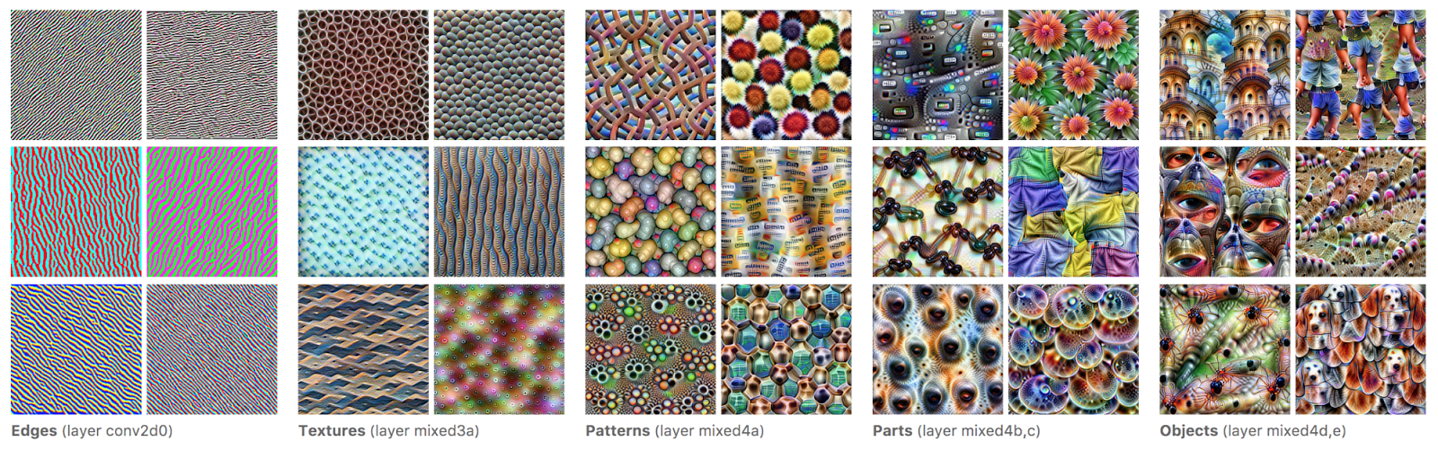
A friend recently recommended that I spend some time reading Chris Olah’s work on neural-network interpretability. There is a lot to choose from, but I decided to begin with Feature Visualization, written by Chris Olah, Alexander Mordvintsev, and Ludwig Schubert.
It turned out to be a good starting point. The article is technical, but it begins with a question that is easy to understand: what kind of input makes a particular part of a neural network respond?
The examples use an image-classification network rather than a language model. That makes the results unusually visual, but the underlying problem is familiar. A model has learned useful internal representations. We can inspect all of its activations and weights, but those numbers do not arrive with labels explaining what they mean. We need methods for turning them into something a person can reason about.
Feature visualization is one way to do that.
Asking the network for an example
The basic technique is surprisingly direct.
Choose a component of the network—a neuron, a channel, a layer, or an output class—and define an objective that rewards its activation. Begin with an image, often random noise, and use gradients to modify the pixels until the chosen component responds strongly.
Normal inference asks, “How does the network respond to this image?” Feature visualization reverses the question: “What image would produce the response I am interested in?”
The resulting images can reveal a rough hierarchy in the network. Earlier layers tend to respond to simple structures such as edges, colours, and textures. Deeper layers respond to more complicated mixtures of shapes and object parts. The network builds its useful abstractions gradually rather than jumping directly from pixels to a finished category.
I found this immediately compelling. Looking at a table of activations might tell me that one channel produced a large number. Looking at an optimized image can give me a hypothesis about why.
The picture is not stored inside the network
A feature visualization is not an image that the model has hidden somewhere in its weights. It is a newly generated input that strongly activates the selected component.
Because the image is generated rather than retrieved, the optimization process has considerable freedom. If we simply maximize an activation with no constraints, the result often fills with high-frequency patterns that look meaningless to us but work extremely well on the network. The article describes these as a kind of neural-network optical illusion, closely related to adversarial examples.
To produce more legible results, researchers add priors and regularization. They penalize high frequencies, transform the image during optimization, change its parameterization, or constrain it using a learned model or examples from a dataset.
These choices are not merely cleanup applied after the experiment. They affect which solution the optimization finds and therefore affect what we see.
I think this is the most useful lesson in the article. An interpretability visualization is a measurement made through an instrument. The objective, regularization, parameterization, and presentation are all parts of that instrument. A beautiful result can be informative, but its visual clarity does not automatically make its interpretation correct.
One feature can have several faces
There is another problem with asking for the image that maximally activates something: we may get one valid answer and mistake it for the whole answer.
A neuron can respond to several related patterns, or even to patterns that do not fit neatly into one human concept. The article explores ways to generate diverse examples rather than a single optimum and compares those visualizations with real examples from the training dataset.
One example initially appears to show a detector for the tops of dogs’ heads. With more varied visualizations and dataset examples, the interpretation shifts toward something closer to fur texture. A spoon with a sufficiently similar colour and texture also activates it.
This is a small example, but it captures a recurring difficulty in interpretability. People are very good at finding a plausible story in an image. The first story may be too narrow, based on an accidental feature of the visualization, or expressed at the wrong level of abstraction.
Looking at diverse optimized inputs helps. Checking the hypothesis against real dataset examples helps more. Neither guarantees that we have identified the feature perfectly, but together they make it harder to settle on the first explanation that looks convincing.
From recognizable features to explanations
Feature visualization answers something like, “What does this component respond to?” That is useful, but it is not the same as explaining how the network reached a particular decision.
Attribution asks which input regions or internal features contributed to an output. Causal interventions can test what changes when a component is removed or modified. Circuit analysis tries to understand how multiple features interact to implement a computation.
Olah and collaborators develop this progression further in The Building Blocks of Interpretability. That article treats feature visualization, attribution, dimensionality reduction, and interface design as composable tools rather than isolated techniques. Their later article Zoom In: An Introduction to Circuits goes beyond identifying individual features and asks whether networks contain recurring, understandable circuits built from them.
That feels like a sensible reading order to me:
- Learn how we can generate examples of what a feature responds to.
- Combine those examples with evidence about where and when the feature affects the result.
- Investigate how features are connected into larger computations.
This also connects with what I found interesting in the ARENA exercises on attention and induction heads. A recognizable attention pattern is a useful observation. The stronger explanation comes from combining that observation with attribution, ablation, and analysis of how components compose.
What this might contribute to AI safety
Feature visualization was developed around image models, and it does not transfer directly to every question we care about in modern language models. It would also be a mistake to assume that every important concept corresponds to one clean neuron waiting to be visualized.
Still, the broader approach seems important for AI safety.
Behavioural evaluations tell us how a model responds to the situations we thought to test. Interpretability methods may help us notice features, strategies, or internal distinctions that we did not know to ask about. They may reveal that a model is relying on a shortcut, responding to an unexpected pattern, or representing something quite different from our initial explanation.
The limitations are equally relevant. An interpretability method can produce persuasive evidence while leaving important alternatives unresolved. A visualization may reflect the model, the probing method, or an interaction between the two. A human-readable feature may correlate with a behaviour without causing it. A component that looks understandable in isolation may play a different role when combined with the rest of the network.
For safety work, the goal cannot simply be to generate explanations that look reasonable. We need explanations that make testable predictions, survive interventions, generalize across inputs, and remain useful when the model or environment changes.
Feature visualization is valuable partly because the article is so open about these problems. It does not present attractive images as the end of the investigation. It treats them as tools for forming hypotheses and then spends much of its time examining how those tools can mislead us.
What I am left thinking about
The article gave me several questions I want to carry into the rest of Olah’s work:
- How much does an interpretation depend on the assumptions built into the visualization method?
- When similar features appear in different models, are they genuinely the same feature or merely correlated with similar inputs?
- How do we move from recognizing what activates a component to explaining the computation it performs?
- Which observations can be validated causally rather than only visually?
- Can these methods scale from relatively clean vision features to distributed representations in large language models?
My main takeaway is that feature visualization makes the inside of a neural network more approachable without pretending that it makes the network simple.
We can ask a component what it responds to and receive something that resembles an answer. But that answer is shaped by the way we asked the question. Understanding the model requires varying the question, checking the result against real behaviour, and combining several kinds of evidence.
That seems like a useful place to begin.